Activity Diagram Modifications & Settings
Modifying the Activity Diagram and its constructs.
| Action Constructs Editing | A review of the Action Constructs Editing Options |
| Actor Branch Construct Editing | A review of the Actor Branch Construct Editing Options |
| Guard Construct Editing | A review of the Guard Construct Editing Options |
| Swimlane Construct Editing | A review of the Swimlane Construct Editing Options |
| Multiple Entities Editing | A review of the Multiple Entities Selected Editing Options |
| Activity Diagram Settings | A review of the Activity Diagram's Wrench Icon and Setting Options |

The previous article on the Activity Diagram provides users with an introductory explanation of the constructs and their functionality on the canvas. In the following section, we will delve into more detail about the options available for the canvas constructs connections, the toolbar frame options that change dependent on the selected constructs and the Activity Diagram's settings.
Action Constructs (Entity,Fork/Join,Decisions (Loop and OR))

Any of the four Action constructs in the Activity Diagram can be connected to each other on the canvas. When you make these connections, it creates an input/output relationship between the first action, which generates the output, and the second action, which receives the output. You can confirm this relationship in the left sidebar after making the connection on the canvas.

Actions can only connect to each other in the Activity Diagram.
Entity & Decision (Loop) Construct Options
Upon selecting an Entity construct, the top of the toolbar frame changes so users may modify it.

The buttons on the top toolbar frame are focused in the image below. Most of these options are available for all of the action constructs, when selected. We will cover all these options then reference specific options for specific action constrcuts below that.
![]()
Open

The Open button allows users to open the entity up into another view.
Bold

This option will Bold the name of the entity construct selected on the canvas.
Italicize

This option will Italicize the name of the construct selected on the canvas.
Change Text Fill Color

Using the HTML Color Picker that drops down from the Text Fill Color Option, users can change the text color of the construct selected on the canvas by selecting the color associated close to the desired color simply inputting in the Hex, R, G, B fields the proper codes and numbers.
Change Fill Color

Using the HTML Color Picker that drops down from the Fill Color Option, users can change the color of the construct selected on the canvas.
Change Stroke/line color

Using the HTML Color Picker that drops down from the Change Line/Stroke Color Option, users can change the color that borders the construct selected on the canvas.
Reset Color back to default

The Reset color back to default option will change the entity selected on the canvas back to the default gray and black colors.
Flatten

When an Action Entity is decomposed by children entities, a Flatten button will appear so users may 'flatten' the hierarchy and have the children actions appear on the diagram in the parent's place. This will remove the decomposed by relationship between the Parent and Children entities.
Script

For more on the Script button, please see this article.
Decision (Or) Additional Option
![]()
Above is the top toolbar frame when a Decision (Or) entity is selected. All of the options are explained in the section above. However, the newest addition is the 'Add Branch' button.

The 'Add Branch' feature allows users to easily add additional branches to the Decision (Or) entity. By default, the Decision (Or) entity includes two branches.
‘Fork/Join (Parallel)’

Upon selecting the ‘Fork/Join (Parallel)’ construct, users may modify the black bar construct on the diagram by selecting the black bar on the canvas. Upon doing so, users will see the top of the toolbar frame change to provide options for modification. These options are focused below.

Change Fill Color

Using the HTML Color Picker that drops down from the Text Fill Color Option, users can change the color of the construct selected on the canvas.
Change Stroke/line color

Using the HTML Color Picker that drops down from the Change Line/Stroke Color Option, users can change the color that borders the construct selected on the canvas.
Reset Color back to default

The Reset color back to default option will change the bar selected on the canvas back to the default black color.
Add Branch

The 'Add Branch' feature allows users to easily add additional branches to the ‘Fork/Join (Parallel)’ construct. By default, the entity includes two branches.
Actor Branch Editing

When you add a Branch Actor to a parallel branch, the top toolbar frame will automatically change (highlighted below) and present users with a variety of options to customize the actor's appearance on the canvas. The relationship created when adding a Branch Actor is that the Branch Actor is performs the Action min Note, as shown below, if you click on the branch actor and drag it on the canvas a line will appear.
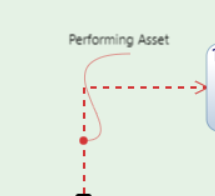
The options highlighted below will be covered in this section.

Bold

This option will Bold the name of the construct selected on the canvas.
Italicize

This option will Italicize the name of the construct selected on the canvas.
Change Text Fill Color
Using the HTML Color Picker that drops down from the Text Fill Color Option, users can change the text color of the construct selected on the canvas by selecting the color associated close to the desired color or simply inputting in the Hex, R, G, B fields the proper codes and numbers.
Change Stroke/line color
Using the HTML Color Picker that drops down from the Change Line/Stroke Color Option, users can change the line of the color and the branch selected on the canvas. An example of this change to red is the orthogonal dashed line shown below.

Reset Color back to default
The Reset color back to default option will change the construct selected on the canvas back to the default black.
Line Options

For the line to the Actor Branch label, users with the Line Options dropdown have the option to hide the label, change the connecting line to straight or orthogonal, or reset the label to reflect the defaulted settings of applying the label to the branch with no line connector and revert back to the defaulted black color (not including the branch color if that has changed).
Guard

The Guard's options are textual, given the nature of the construct. Below will go over the editing options for the Guard that are provided on the top of the toolbar frame.
Bold
This option will Bold the name of the Guard selected on the canvas.
Italicize

This option will Italicize the name of the Guard selected on the canvas.
Change Text Fill Color

Using the HTML Color Picker that drops down from the Text Fill Color Option, users can change the text color of the multiple entities selected on the canvas by selecting the color associated close to the desired color or by simply inputting in the Hex, R, G, B fields the proper codes and numbers.
Reset Color back to default

The Reset color back to default option will change the entity selected on the canvas back to the default black.
Swimlane

As highlighted below, the options for the Swimlane construct will be covered.
![]()
Bold

This option will Bold the name of the Guard selected on the canvas.
Italicize
This option will Italicize the name of the Guard selected on the canvas.
Change Text Fill Color

Using the HTML Color Picker that drops down from the Text Fill Color Option, users can change the text color of the multiple entities selected on the canvas by selecting the color associated close to the desired color simply inputting in the fields the proper codes and numbers.
Change Fill Color

Using the HTML Color Picker that drops down from the Text Fill Color Option, users can change the color of the constructs of the multiple entities selected on the canvas.
Change Stroke/line color

Using the HTML Color Picker that drops down from the Change Line/Stroke Color Option, users can change the color that borders the constructs of the multiple entities selected on the canvas.
Reset Color back to default

The Reset color back to default option will change the entity selected on the canvas back to the default black.
Vertical/Horizontal Swimlane

Selecting this option on the toolbar frame will turn the selected swimlane to be vertical or horizontal, depending on its current orientation.
Send Swimlane to Background
This particular button is helpful when handling multiple swimlanes when they're both vertical and horizontal. This will allow the selected swimlane to be in the background behind another swimlane.
Multiple Entities Selected

Users may drag their cursor outside of the constructs and a box will appear to select as many multiple entities the user desires. Many features on the top toolbar will appear upon doing so for the user to utilize. Let's go over each option as highlighted below.
![]()
Bold

This option will Bold all the names of the multiple entities selected on the canvas.
Italicize

This option will Italicize all the names of the multiple entities selected on the canvas.
Change Text Fill Color

Using the HTML Color Picker that drops down from the Text Fill Color Option, users can change the text color of the multiple entities selected on the canvas by selecting the color associated close to the desired color simply inputting in the fields the proper codes and numbers.
Change Fill Color

Using the HTML Color Picker that drops down from the Text Fill Color Option, users can change the color of the constructs of the multiple entities selected on the canvas.
Change Stroke/line color
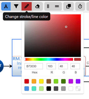
Using the HTML Color Picker that drops down from the Change Line/Stroke Color Option, users can change the color that borders the constructs of the multiple entities selected on the canvas.
Reset Color back to default
The Reset color back to default option will change the multiple entities selected on the canvas back to the default gray and black colors.
Align Vertically

This selection will align the constructs vertically for the multiple entities selected on the canvas.
Align Horizontally
This selection will align the constructs horizontally for the multiple entities selected on the canvas.
Group Apply Duration Attribute

The Group Apply Duration Attribute option is a pop up that allows users to apply the same number to the Duration Attribute for the multiple entities selected:

Decompose
The Decompose Button will turn the multiple entities selected into a child diagram. A new entity will appear in the place of the constructs on the canvas and by default will be called "Parent of XYZ entities." Users may of course at this point change the name of the Parent Entity.
Settings Wrench/Dropdown

The wrench icon is a fixed dropdown at the top right of the toolbar is where more options and settings are available for users to utilize.
Generate Asset Diagram

Users may Generate an Asset Diagram from their Activity Diagram, given the proper relationships were made to the Actions and Branch Actors are present in the Diagram.
Cross Project Indicators

This setting will hide or show the cross project indicators on entities that are from another project.
SysML Frame Edits

⚠️The SySML Frame is the green space the model is placed in on the canvas.

The Edit SysML Frame option will bring up the following modal.

Users may select the color of the frame with the  button indicated in green (the green color on the button will change to whatever color a user is set to). Or bring it back to the defaulted green with the reset option
  .
.
The remaining options on the Modal are in relation to the Diagram Header located at the top left of the SysML frame, example below.
![]()
The changes made to the Select SysML Diagram option refer to the Model Element Type in the first brackets (ex. [Block] in the picture above. Note, the example above is from an Activity Diagram but shows the Block option as displayed in the aforementioned Modal. Therefore it is important to note, users may select a different digram type here, even if you're in a different diagram. The text will change but this option will not change the diagram itself.
The Select Parent option is dropdown to select the Parent entity for the Model Element Name. This will change the text in between the bracketed texts. In the example above it is the 'Provide Alerts' text.
Hide/Show SysML Frame

Users may use this option to hide or show the SysML Frame as they wish.
Auto Number, Layout and Reset Diagram

Users may also Auto Number their diagrams, where a pop up shows up to allow users to use the action order to determine the number sequence, provide a Prefix or enumerate the single level, as shown below.
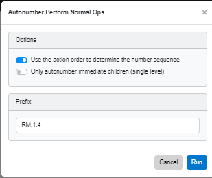
Lastly, the final options provide users to reset their diagram and layout the diagram after changes have been made.
The very last option, 'Help,' will send users directly to the Help Center page for the Activity Diagram for convenience.
Frame Fix
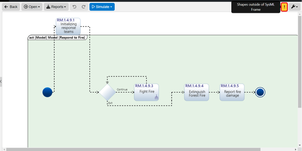
When a construct is ouside of the SysML Frame, Innoslate will detect that and bring up a fix for this as indicaited with the orange exclamation point that appears next to the Settings dropdown.
When selected, a modal pops up to provide users the ability to fix or ignore the issue.

To continue learning about SysML Diagrams, Click Here.
(Next Article: Block Definition Diagram (BDD))

