
| Class Construct Editing | A review of the Class Construct Editing Options |
| Operation, Attribute, Input Parameter and Return Type Construct Editing | A review of these constructs editing options |
| Line Construct Editing | A review of the Line Constructs Editing Options |
| Multiple Entities Editing | A review of the Multiple Entities Selected Editing Options |
| Class Diagram Settings |
A review of the Class Diagram's Setting Options
|
Class Construct Editing
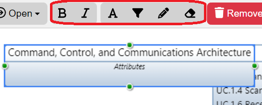
Upon selecting the Class (Asset) construct, the top of the toolbar frame changes to provide editing options for users to modify it. The options highlighted above will be covered below.
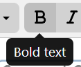
Bold
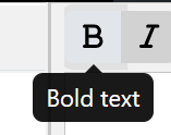
This option will Bold the name of the Class construct selected on the canvas.
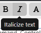
Italicize
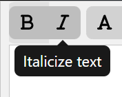
This option will Italicize the name of the Class construct selected on the canvas.
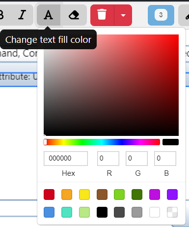
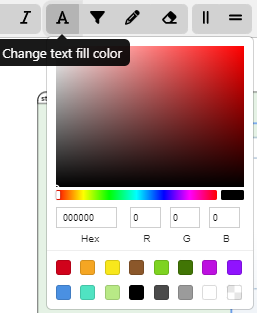
Change Text Fill Color
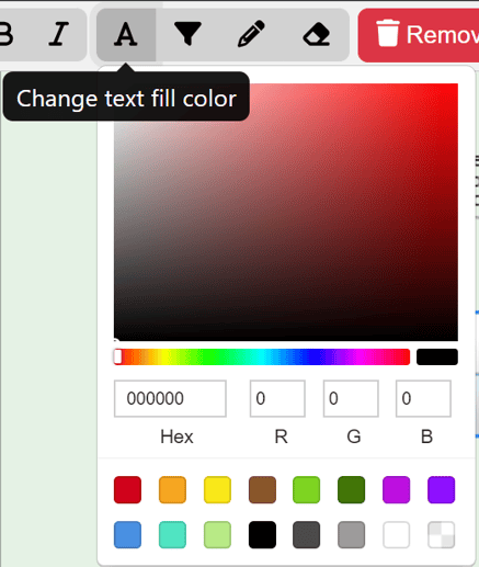
Using the HTML Color Picker that drops down from the Text Fill Color Option, users can change the text color of the Class construct selected on the canvas by selecting the color associated to the desired color or by simply inputting in the Hex, R, G, B fields the proper codes and numbers.
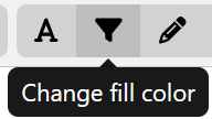
Change Fill Color
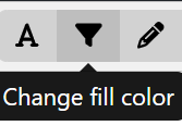
Using the HTML Color Picker that drops down from the Change Fill Color Option, users can change the filling color of the Class construct selected on the canvas.
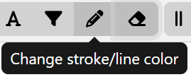
Change Stroke/line color
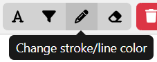
Using the HTML Color Picker that drops down from the Change Stroke/Line Color Option, users can change the color that borders the Class construct selected on the canvas.
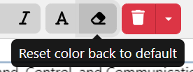
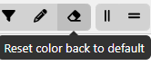
Reset Color back to default
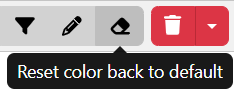
The Reset color back to default option will change the Class construct selected on the canvas back to the default gray and black colors.
Operation, Attribute, Input Paramenter and Return Type Construct Editing

Upon selecting an Operation, Attribute, Input Paramenter or Return Type construct, the top of the toolbar frame changes to provide editing options for users to modify it. All 4 of these constructs provide the same options as highlighted above. These will be covered below.
This option will Bold the name of the construct selected on the canvas.
This option will Italicize the name of the construct selected on the canvas.
Using the HTML Color Picker that drops down from the Text Fill Color Option, users can change the text color of the construct selected by selecting the color associated to the desired color or by simply inputting in the Hex, R, G, B fields the proper codes and numbers.
The Reset color back to default option will change the text selected back to the default black color.
Line Construct Editing

When a line construct in the Class Diagram is selected, users may edit it with the options highlighted above. The highlighted options in the image above on the top toolbar frame are covered below.
Change Stroke/Line Color

Using the HTML Color Picker that drops down from the Change Stroke/Line Color Option, users can change the color of the line selected on the canvas by selecting the color associated to the desired color or by simply inputting in the Hex, R, G, B fields the proper codes and numbers.
Reset Color Back to Default

The Reset color back to default option will change the Line selected on the canvas back to the default black color.
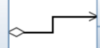
Line Options

Following along with the dropdown, users may change the Line construct to straight or orthogonal. The line's name label may be shown (or hidden, if shown). If the label is dragged and dropped away from the line, a line will be tied to the label to indicate the connection the label is tied to. In this case, the the label's line type can be straight or curved (example in initial line construct image above). Lastly, the label can be reset to its defaulted state and undo changes made to it.
Paths

The Paths dropdown provides users the ability to change the line's relationship type.
Below displays the line style for each option.
 Aggregation
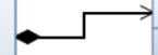 Composition
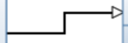 Generalization
 Simple Association
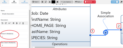
Simple Association allows users to add Multiplicity on the Simple Association line. It is a Logical entity, so this allows users to apply Multiplicity Attributes that can be added on the left sidebar under the Attributes Tab. These Multiplicity Attributes are also displayed on the Simple Association line as shown above.
Multiple Entities Editing
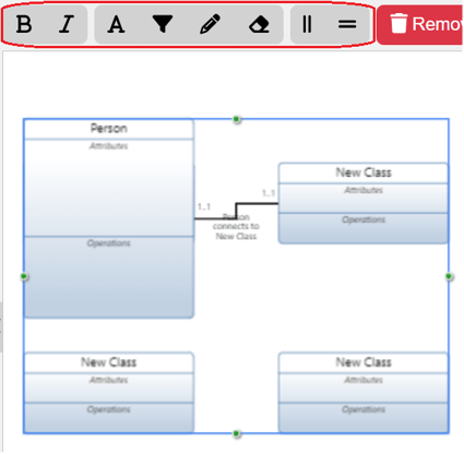
To select multiple classes on the canvas, users can simply drag their cursor outside of the constructs and a box will appear. This allows users to choose as many classes as they desire. Once selected, editing options will appear on the top toolbar for users to utilize. Let's explore each option as highlighted above.
Bold
This option will Bold all the names of the multiple constructs on the Class construct.
Italicize
This option will Italicize all the names of the multiple constructs on the Class construct.
Change Text Fill Color
Using the HTML Color Picker that drops down from the Text Fill Color Option, users can change the text color of the multiple constructs on the Class construct selected on the canvas by selecting the color associated close to the desired color simply inputting in the Hex, R, G, B fields the proper codes and numbers.
Change Fill Color
Using the HTML Color Picker that drops down from the Text Fill Color Option, users can change the color of the multiple constructs on the Class construct selected on the canvas.
Change Stroke/line color
Using the HTML Color Picker that drops down from the Change Line/Stroke Color Option, users can change the color of the multiple constructs on the Class construct selected on the canvas.
Reset Color back to default
The Reset color back to default option will change the name of the multiple constructs on the Class construct selected on the canvas back to the default black color.
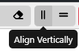
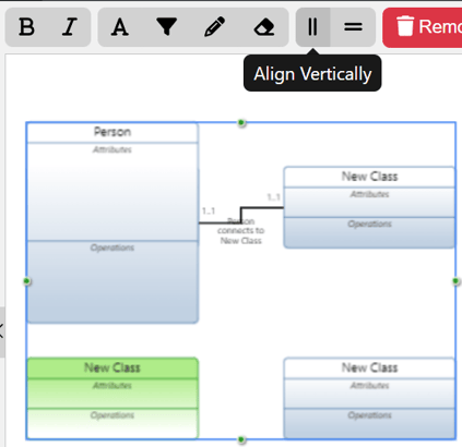
Align Vertically
This selection will align the constructs vertically for the multiple Classes selected on the canvas. The vertical line will start with the highlighted green State, as shown below.
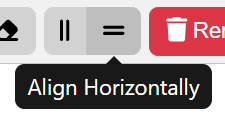
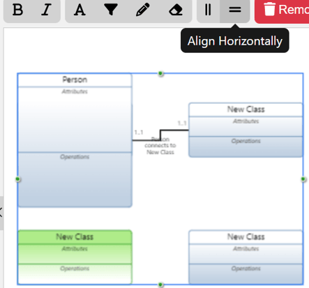
Align Horizontally
This selection will align the constructs horizontally for the multiple Classes selected on the canvas. The horizontal line will start with the highlighted green Class construct, as shown below.
Class Diagram Settings
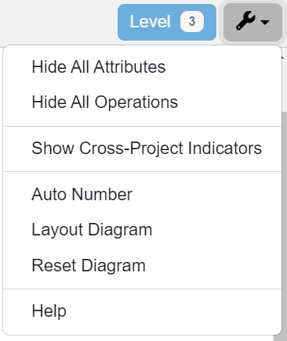
The above Class Diagram Settings is the wrench icon on the top right of the toolbar frame. This button is a fixed dropdown and does not change dependent on what the user has selected. Let's delve into the options available in this dropdown below.
Hide/Show Attributes & Operations
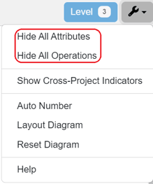
Users may hide the attributes and operations as desired with the highlighted options above.
Show/Hide Cross- Project Indicators
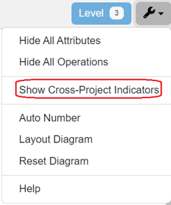
Users may show (or hide, if shown) the indicators on the constructs brought into the model from another Innoslate project.
Auto Number
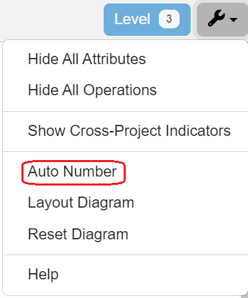
Users may Auto Number the Class constructs with the modal pops up when this option is selected. Users may autonumber the single level displayed and/or add a Prefix.

Layout, Reset Diagram & Help
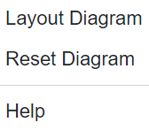
Lastly, the final options provide users to reset their diagram after changes and layout the diagram after changes are made.
The very last option, 'Help,' will send users directly to the Help Center page for the Class Diagram for convenience.
To continue learning about General Diagrams, Click Here.
(Next Article: Hierarchy Diagram)