
Innoslate offers 25 distinct diagram types, each designed to support various aspects of systems engineering and project management. With the variety of diagrams and Innoslate’s seamless ability to switch between different diagram views, understanding how to navigate and modify these diagrams is essential for effective interaction and management. This guide outlines the main components of the diagram view and their expected behaviors to help users work efficiently with any diagram.
Diagram View Components

Diagrams View Overview
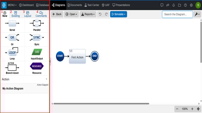
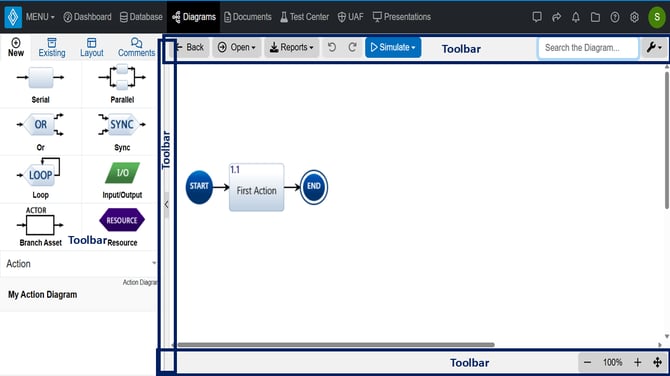
When working in a diagram, there are three primary areas to understand:
- Left Sidebar (No entity selected)- The panel on the left, which provides tools and options for creating and modifying diagram elements (Red).
- Left Sidebar (with entity selected) The panel on the left will change to provide options for that entity (Metadata, Attributes, Relationships, Comments).
- Toolbar Frame- The border surrounding the canvas, offering additional controls and settings (Blue).
- Canvas- The central white space where users create and arrange diagram constructs (Green).
Creating Action Diagram
As shown in the video above, when starting a new Action Diagram (or similar), the canvas starts as a blank workspace. Drag and drop a construct from the left sidebar onto the canvas to start creating your diagram (usually also making an entity in the database). Innoslate automatically selects the chosen construct (highlighted with a blue outline), and the left sidebar and toolbar update to show options for editing its metadata, attributes, relationships, and appearance.
For example, dragging a serial construct onto the canvas switches the left sidebar to three tabs for Metadata, Attributes, and Relationships. The top toolbar provides options to adjust text style, colors, and more.
Clicking outside a selected construct on the canvas deselects it, shifting focus to the entire diagram (root entity). The sidebar and toolbar update accordingly. If changes were made, a green 'Save' button appears; clicking it saves and redirects to the project’s Diagrams Dashboard.
Left Sidebar
The left sidebar adapts depending on selection when in a Diagrams View.
Left Sidebar of Action Diagram- No Entity Selected (v4.12)
Left Sidebar: No Entity Selected
When no construct is selected on the canvas, the left sidebar displays 4 tabs:
- New: Allows users to create new entities by dragging and dropping constructs onto the canvas. Available constructs vary by diagram type. For example, an Action Diagram offers eight constructs. Some diagrams support multiple entity classes, with a dropdown below the constructs to select the desired class. Users can also modify the root entity’s name, number, and description directly from this tab.
- Existing: Enables users to add existing project entities to the diagram. Users can search for entities by name or number (e.g., typing name: or number: in the search field). Selected entities appear in the sidebar and can be dragged onto the canvas.
- Layout (introduced in version 4.12): Enhances diagram layout management. Because Innoslate is data-driven, changes to diagram data outside the current view can affect the diagram’s layout. The Layout tab allows users to preview and revert to previous layouts to maintain diagram clarity.
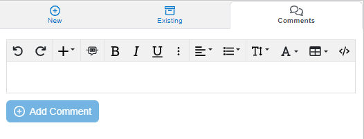
- Comments: Allows users to add comments to the root entity of the diagram when no construct is selected.
New Tab
The 'New' tab enables users to create n (ew entities by simply dragging and dropping a construct from the table to the canvas. The available constructs in this tab will vary depending on the specific diagram being used. In the image above, users can select from 8 different constructs for their Action Diagram.
Some diagrams allow for multiple classes of entity types. The new tab in these diagrams will have a dropdown right below the constructs to select the desired class for the entity/construct, as shown in the below image.

Select Diagram Construct Class- Left Sidebar (v4.12)
Lastly under the new tab, users can modify the root entity name, number and description info when users select the name on the left sidebar.

Modify Root Entity from Left Sidebar (v4.12)
Existing
 Selecting Existing Entities Left Sidebar (v4.12)
The 'Existing' tab is for bringing in already existing entities from the project to the diagram. The available entities Innoslate pulls up in the dropdown will depend on the diagram the user is in. Users may type in the field (red box in image below) to find a certain entity by number or name (you can type name: or number:).
When a user selects an entity or entities, they will appear in the left sidebar behind the dropdown as shown in the image below (to view the entities under the dropdown, simply click anywhere in the left sidebar outside of the dropdown).
Access Cross-Project Entities
 This gear icon next to the dropdown field in the existing tab allows for users to recall another project to bring in those entities. We call this Cross Project Relationships. Upon selecting entities from other projects, the constructs will appear and users can drag and drop these entities as shown in the video above. This icon also allows users to change the limit of entities to display in this dropdown:

Cross-Project Menu UI
After bringing in your desired existing entities, users can easily drag and drop the existing entities onto the canvas, as demonstrated in the accompanying video:
Adding Existing Entities to Action Diagram Video
Layout

Layout Tab with previous layouts saved (v4.12)
In Innoslate version 4.12, we introduce the Layout tab to streamline diagram layout management. As Innoslate is a data-driven platform and diagrams are dynamic, changes to diagram data made outside the current view (e.g., in other diagrams or entities) can impact the layout of your diagram. The Layout tab is an essential tool for managing and organizing your diagrams over time. It allows you to view, select, and restore previously saved layouts, helping you maintain clarity as your project evolves.
 Disable Eternal Auto Layout in Diagram Settings (v4.12)
We have also added a switch to turn off the dynamic behavior for your convenience in the Settings Menu for every applicable Diagram. Disable Eternal Auto Layout in Diagram Settings (v4.12). This feature allows you to manually control when layout updates occur, which can be particularly beneficial in scenarios where you want to preserve a specific configuration or prevent automatic changes due to external data updates.
Additionally, Innoslate’s layout versioning is designed to help you manage complex changes across your project’s lifecycle. For example, if you have created ten layout versions for a diagram and decide to revert to layout 5, Innoslate intelligently uses layout 5 as your new baseline. This means any entities or constructs added in layouts 6 through 10 will still be included, but their spatial arrangement will reflect the settings from layout 5. This approach enables you to roll back unwanted changes while retaining the progress or new elements introduced in more recent layouts, providing a balance between flexibility and control for systems engineering teams managing evolving projects.
Layout Tab UI

Layout Tab UI Image (v4.12)
The above image illustrates the Layout tab interface in Innoslate version 4.12, which is designed to enhance diagram layout management. The interface shows a list of layout versions, each associated with an author, date, and time of modification. Key elements include:
- Layout Version Number: Indicates the sequence of saved layouts (e.g., 1, 2, 3, 4), allowing users to track changes over time. Note, the oldest version starts at 1.
- Preview Button: Displays a visual representation of the selected layout version, such as the diagram layout created by "joannahmoore" on 9/22/2025 at 1:22:27 PM.
- Apply Layout: A button to apply the selected layout version to the current diagram.
- Last Modified Author, Date and Time: Shows the most recent update details, e.g., "joannahmoore" on 9/22/2025 at 1:21:30 PM.
Comments Tab
The final tab from the left sidebar is for commenting. Since there is no construct selected on the canvas, so these comments will be placed on the root entity of the diagram.
Comments Tab (v4.11)
Left Sidebar- Entity Selected

Diagrams View- Left Sidebar with Entity Selected Highlighted
When an entity is selected on the canvas, the left sidebar will provide 3 tabs to modify it. The 3 tabs from left to right are 'Metadata', 'Attributes' and 'Relationships'.
The Metadata Tab provides the entity's metadata such as Global ID, Project ID, Entity Class, Created and Modified information, and labels that are or can be associated with it.
The Attributes Tab allows users to modify the entity's attributes. Attributes depend on the Entity Class and can be modified in the Schema Editor.
The Relationships Tab allows users to see the entity's traceability to other entities in the project.
Toolbar Frame
Diagrams View- Toolbar Highlighted
The frame, highlighted in yellow above, surrounding the white canvas is the toolbar frame. This toolbar frame gives users more features to utilize in their diagrams. The toolbar frame options will vary based on the diagram type and change depending on the selected construct in the canvas. For example, if users select a specific construct on the canvas, the top of the toolbar frame will change to allow for more modifications. In the image below, you can see that 'Launch Payload to Orbit' has been selected. Innoslate indicates this selection with a blue frame.
Below, you can see a closer look at most options in the toolbar frame when an entity is selected. Going from left to right, these options allows users to 'Open' into a different view, 'Bold' or 'Italicize' the name , 'Change text color', 'Change fill color of the construct', 'Change the outline color of the construct', or 'reset the colors back to default' (all these modifications all apply to the construct's appearance on the diagram). Constructs with a decomposed ribbon means it has a 'decomposed by' relationship with children entities so there is also a flatten option. Lastly, users may also add their own JavaScript to the entity (this option is only for Action class entities only for simulating purposes) and can remove the entity from the diagram or delete from the database.

Again, depending on what the user selects on the diagram, the options in the top of the toolbar frame will reflect the applicable options for that selected construct. Another example of this is when a line is selected, the options on the top change to reflect modifications available for that line as shown below (the blue line marked as 'continue ops' indicates that is the selected construct). The line itself is not an existing entity in the database, so only the top toolbar in this case changes and provides options to change it's color, reset to default or change the line option.

Search the Diagram
Search Diagram Feature: Spider Diagram
Beginning with Innoslate v4.12.2.0, all diagram types now include a dedicated Search field in the toolbar. This feature allows users to quickly query and locate entities displayed on the diagram canvas by searching their name, number, or description. This enhancement improves navigation and efficiency when working with large or complex diagrams.
While searching, the diagram canvas temporarily freezes to highlight matching entities. Use the arrow buttons next to the search field to cycle through results. Each selected entity is highlighted on the canvas, and the left sidebar automatically updates to display that entity's data—no additional navigation required.
You may also directly apply toolbar editing options to the searched construct to modify the currently highlighted entity.
Wrench/Settings Icon
Moving to the far most right of the toolbar frame, there is a wrench icon indicating the Settings Menu. The wrench icon in the top right corner of the toolbar frame is a dropdown menu that provides additional features and settings to utilize. The features available are applicable to the diagram that the user is currently working with. The image below are the options available in this dropdown for the Action Diagram. The dropdown may provide users with options such as hiding certain constructs of the diagram, how many levels can be viewed, generate another view, and/or show/hide indicators. Users can also auto number, reset the diagram and layout the diagram. Lastly, there is always a help button to direct the user to the corresponding diagram's help page.

Action Diagram Settings (v4.12)
⚠️We strongly recommend exploring the wrench icon in your most used diagrams as users familiarize themselves with Innoslate's diagrams. The wrench icon provides users with a wide range of valuable features that can greatly enhance their experience, dependent on the diagram.
Bottom of Toolbar Frame
Diagrams View: Bottom Toolbar- Asset Diagram
The bottom of the toolbar frame allows users to zoom in and out of the canvas space of the diagram with the '-' and '+' on the lower right of the frame. Users may also use the auto placement option by selecting the 4 arrow icon all the way on the right. In the Asset Diagram only, users will see the 'Change Background' option as shown in the image above.
Left Toolbar Frame- Hide Sidebar

Diagrams View Toolbar- Hide Sidebar Highlighted
Lastly, note the left of the toolbar frame also contains a hide sidebar button. If users are not seeing their left sidebar, use this button to expand the left side bar.
Canvas
 Diagrams View- Canvas Highlighted in Green
The Canvas provides users the space to create their diagrams via drag and drop, make entities connect to each other (creates relationships) and select multiple entities for modification. Below we'll cover this behavior.
Users may connect entities from one to another on the canvas when there is a green dot on the side of the entity when its selected and the new entity it connects to turns green. In the below example, the New Action on the bottom right is selected by selecting the green dot and dragging a line to connect to 1.3 New Action. Connecting one entity to another like this will create a relationship between them. Depending on the diagram type and entity class, the relationship created in the canvas follows the Lifecycle Modeling Language. The image below is connecting two entities to each other in a Spider Diagram.

When multiple entities are selected, as indicated in the blue frame in the image below, the top toolbar frame will provide many options to modify the selected entities. Users may modify their text and coloring, align vertically or horizontally, clone, group apply attributes, turn them into a child diagram (decompose) or delete them.

Users can see a lot of the action explained in the article above with the video below: