

Creating an X/Y Plot chart
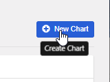
Step 1: Navigate to ‘Charts Dashboard’, then click on ‘New Chart’
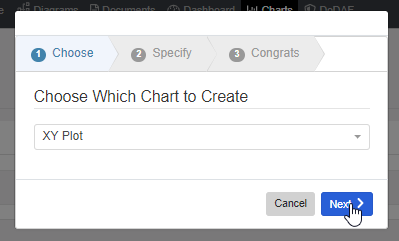
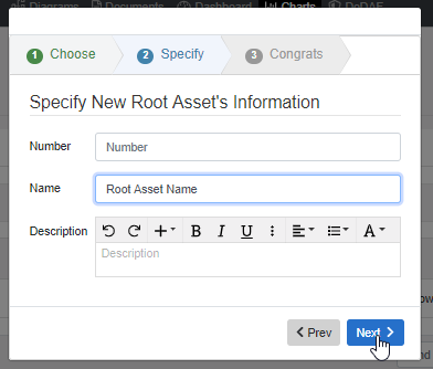
Step 2: Choose ‘XY Plot’, give the root asset a name or number, then click ‘Next’, then click ‘Finish’.
Step 3: Click on the ‘Import’ button found in the XY Plot toolbar.

Step 4: Browse for the CSV to be imported, or drop the file into the upload box. Decide between Entity and Non-Entity Mode. By default, Non-Entity mode is selected. To toggle between them click on the check box. Once you finish the Import that mode will be locked for that XY Plot. Once it is imported, click ‘Next’.

Step 5: Select which column to use for the X-axis and Y-axis. Also, choose whether the entities will be imported as Characteristics or Measures. Click ‘Apply’ when you are done.

Step 6: Edit and validate your data and remove any rows that should not be included in the dataset. When you are done, click ‘Apply’.

Step 7: Look over the generated preview, and click ‘Apply’.

X/Y Plot Settings
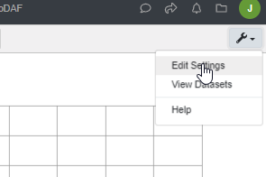
To edit and configure your X/Y Plot settings, click on the wrench button at the top right, then select ‘Edit Settings.’
From here you can edit the look of your XY Plot, as well as change the axis type from Linear to Logarithmic. After the changes have been made, scroll down to the bottom of the modal and click on ‘Apply’.

Add and Edit Data
In order to edit the data within your XY Plot, simply click the wrench at the top right, then select ‘View Datasets’.
.png?width=220&name=xy_datasets%20(1).png)
From here you should be able to remove any unneeded data and add more data if needed by either adding another row and manually inputting the values for X and Y, or by clicking ‘Add Existing’, and selecting a root asset whose characteristics/measures are plottable. Click ‘Apply’ when done. See example below:
Step 1: Click ‘Add Existing’

Step 2: Select the parent asset whose plottable characteristics/measures should be added to the plot.
Step 3: Click ‘Add Asset’

Step 4 (Optional): Modify the color of the new data to be plotted
Step 5: Click ‘Apply’ to confirm changes/additions.

Step 6: Click ‘Save’ to apply the changes to the XY Plot.
